Best College Football Uniforms – Week 9
The best college football uniforms for Week 9 of the season, as Campus Insiders turns into #FashionInsiders. This week, we go coast-to-coast from Washington State to South Florida.
The number 9. Gordie Howe, Bobby Hull and, more recently, Drew Brees and Javier Baez immediately come to my mind when I see that number. It’s also the number of fully intact fingers Jerry Garcia used to noodle away with on his guitar. Yes, it’s Week 9 of the college football season. We’ve got some good games on tap this week, as Nebraska heads to Wisconsin, Washington invades Utah (Alright be honest, who would win that literal battle? My money is on the good people from Washington), and, most notably, No. 12 Florida State hosts No. 3 Clemson.
In the swag department, there are quite a few good looking uniforms this week. Having to narrow it down to just three kept me up all night last night (or maybe it was just my adrenaline after the Cubs’ Game 2 victory over Cleveland).
Buckle up; here we go.
Best Uniforms For Week 9
NOTE: A thread count grading system is used to evaluate all uniforms. It was developed with proprietary technology in the Campus Insiders fashion lab, and ranges from 1-1,000.
3) Washington State
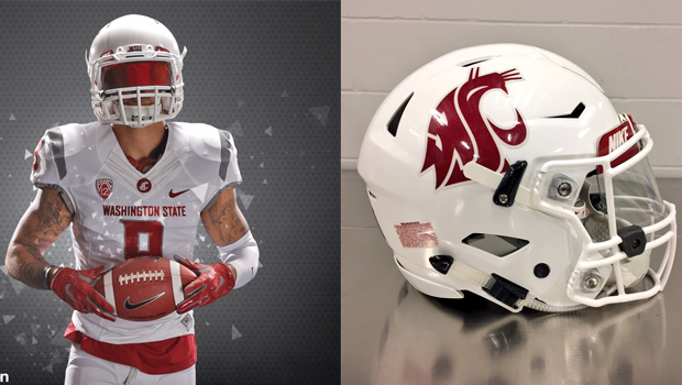
The Cougars are going straight ice this week as they head to Oregon State to take on the Beavers, and I like it. I’m being serious about that “ice” part, too. These uniforms make Wazzu look like they could star in a Smirnoff Ice commercial. Just have a player bust through a wall of cubes wearing this uniform icing Mike Leach. The NCAA would likely frown upon that commercial idea, but it’d at least be entertaining.
Going all white is a bold move these days. There are so many teams who do it that the market is nearly saturated. Washington State passes the test, however, and it all starts with their lids. That red cougar logo slapped on the white helmet is a really clean look that some teams struggle to pull off. A lot of it has to do with the color of the logo being used on the white helmet, and in this instance, Wazzu’s crimson is a great compliment to the white.
The Cougars wear Nike, which as I’ve said before is likely my personal favorite brand when it comes to football uniforms. One of the main things that I like about Nike’s unis is what they do with their collars. It’s really not much, but those thin lines that Nike places on most of their jersey collars is a really cool look. You can see it in the picture above. Add in the circular logo at the V of the collar, and Washington State is off to a good start with their jersey. Like with the helmet, the crimson letters and numbers on the jersey mesh really well with the white and are easy to read. The grey stripe on either shoulder adds a nice little touch and brings in the Cougars’ secondary color.
The white pants are pretty basic with the team logo on the hip and a grey stripe going down both legs.
The all-white look can be a tricky one to successfully pull off, but the Cougars have done a solid job.
Thread Count: 715
2) Illinois
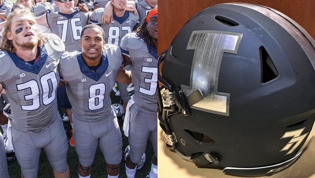
Last week it was Colorado going the grey route with their uniform combo. This week, it’s Illinois doing it for their homecoming game. The Illini refer to these as their “Gray Ghost” uniforms in honor of the great Red Grange who had his number 77 retired by both the Illini and the Chicago Bears. The concept is based off of Grange’s nickname, “The Galloping Ghost.”
Illinois has worn this uniform in the past, but this week will be the first time they have worn their new matte, navy blue helmet with metallic-silver logos and stripes. It’s a really cool and unique look that fits nicely with the colors of the rest of the uniform. I love how Grange’s 77 is there on the back of the helmet.
The best aspect of the remainder of the uniform lays at the front of the collar. You can faintly see it in the picture above, but one of Illinois’ logos is present there. The uniform designers intentionally made the logo tough to see, though from some angles, it becomes more visible. This plays into the the whole “ghost” theme. Truly a very creative concept to help fit the uniform’s motif. The white font on the jersey was a must, as any other color would have made it tough on the fans to read.
This is a case where the uniform itself isn’t great nor bad, but the concept behind it is phenomenal. Illinois was able to pull this off well enough that it should become a new permanent tradition.
Thread Count: 750
1) University of South Florida
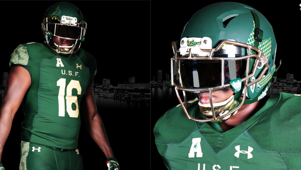
Here’s something we don’t see everyday unless we’re talking about Oregon: South Florida is going all-green this week. The new uniform is inspired by an old airfield that was used for testing during World War II. The airfield rested on what is now the South Florida campus in Tampa. We learn something new everyday, don’t we?
The helmets here are sweet: matte-green with green and gold checkered logos on both sides, and a gold chrome facemask. If any players actually choose to wear a dark visor as shown in the pictures above, that would enhance the look even more.
The jerseys are quite basic, but there are some features that pay tribute to the military. Across the top of the chest reads “U.S.F.” The font used is one commonly associated with the military. If you look close, you can see the little “line” that splits each letter in half. I wish they would have used this same look with the jersey numbers, but oh well.
If you look at the jersey sleeves and then the sides of the pants, you’ll see what looks almost like a camouflage pattern. However, it’s not your normal “camo” look. To me, and I could be wrong here, it looks like the type of disguise that our military used to place over the tops of their bases back in the WWII days so that the base could not be identified from the air. They did this in case any enemy aircraft happened to fly over the base. Again, I could be wrong with my assumption, but that’s what it looks like to me.
This is a cool uniform that I’d want to wear if I played football, and its subtle tributes to the military make it that much better.
Thread Count: 820
Final Thought
This one deals with college basketball. Normally I wouldn’t include another sport other than football, but this needs addressing.
A few of our guys got to try on all of our @Jumpman23 uniforms today. #mubb @Big_Smooth10 @SwaggyDu1 @TheEngine21 @chosenJAUN pic.twitter.com/HggWZATjpO
— MarquetteMBB (@MarquetteMBB) October 26, 2016
What in the world was running through the minds of the people who designed this jersey (made by Michael Jordan’s “Jumpman” brand), as well as the people at Marquette who approved it? It looks like one of those old, sweaty jerseys we had to wear in gym class all throughout middle school when playing any team sport. I feel like I could go get a wife-beater, paint it yellow, wash it a few times to shrink it a bit, and get the same appearance. These jerseys are way too tight, way too thin, and way too horrible. Marquette has these in white, navy blue, and powder blue. So they’ve got that going for them, which is bad.