Campus Insiders’ 2017 Tournament Of Uniforms: Hockey Region
We put the best of the best uniforms in college sports head-to-head in the first ever Campus Insiders uniform tournament.
We put the best of the best uniforms in college sports head-to-head in the first ever Campus Insiders uniform tournament.
Three down, one to go. That brings us to the frozen pond for one of my favorite regions: Hockey. If football doesn’t have the best uniforms in sports, then it’s hockey. And in terms of straight up jerseys, or in hockey’s case sweaters, no sport compares. The variety of possible designs that can be used when creating a hockey sweater is incredible, which leads to many creative and unique looks across the sport at both the professional and unprofessional levels.
With that, let’s take a look at our sixteen combatants.
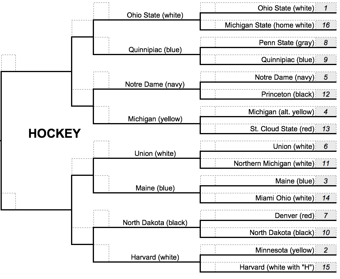
Hockey Region
No. 1 Ohio State vs. No. 16 Michigan State
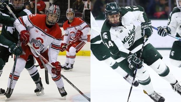
Facing off in our first matchup of the region, we have two Big Ten programs going head-to-head. Ohio State comes into this tournament with a major advantage, at least in this region. Their helmets are spectacular. They copied the look of the school’s football helmets, and that was a genius decision. As for the sweaters, I’m really liking the red/scarlet shoulders with the silver and black-striped trimming.
The Spartans, while not on the same level as Ohio State here, still have one of the better uniforms in the nation. Their green and white combo is not seen anywhere else in college, and it creates a really clean looking uniform set.
Voting Results: Ohio State wins, 4-1
No. 8 Penn State vs. No. 9 Quinnipiac
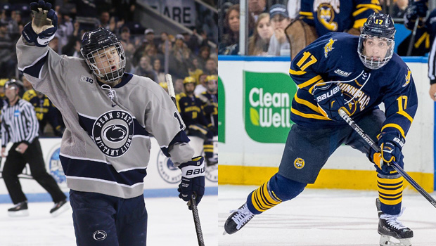
Penn State was only recently recognized as an official Divsion 1 hockey program. Prior to the 2012-13 season, the Nittany Lions were still considered a club team. Yet they’ve already established themselves as one of the top programs in the country. And not only that, they’re well on their way to also being recognized as owning one of the better sets of uniforms in the Big Ten, which is saying something. These gray ones are the best of their bunch.
Quinnipiac, if you’re unfamiliar with the name, has been one of the better hockey programs in the nation for quite some time. They have appeared in two Frozen Fours since 2013, taking runner-up in both instances. I had a feeling when opening this region up for voting that this matchup would be a close one. I mean, what’s not to like about either one of these uniforms? In the end, the voting ended in a tie between my co-workers, forcing me to step in and take the reigns.
Voting Results: Qunnipiac wins, 3-2
No. 5 Notre Dame vs. No. 12 Princeton
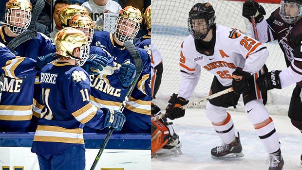
I think the helmets worn by Notre Dame should give you and idea of where this one is headed…
Voting Results: Notre Dame wins, 5-0
No. 4 Michigan vs. No. 13 St. Cloud State
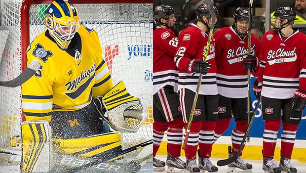
Similar to what Ohio State did with their helmets, Michigan also employs the same design on their lids that is worn by the Wolverines’ football team. And, like the Buckeyes, Michigan’s helmets are spectacular. Moving down to their sweaters, it’s hard not to be drawn towards that yellow. The color absolutely radiates off of those things and really appeals to the eye.
St. Cloud State has a much more basic look to their uniforms. They followed a similar sweater design to what’s worn by the Chicago Blackhawks, only the Huskies don’t quite compare to Chicago. What’s also somewhat interesting is that their logo (can be seen on their shorts) is extremely reminiscent of another original six team: the Montreal Canadiens. At the end of the day, there’s simply not enough originality to the Huskies’ uniforms.
Voting Results: Michigan wins, 3-2
No. 6 Union vs. No. 11 Northern Michigan
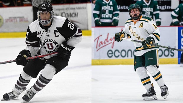
The circular chest logo, as worn by Union, is one of my favorite looks in hockey. Having an actual logo in the center with wording circling around it is, to me, a fantastic sweater centerpiece. I also really like what Union has going on with their sleeves and socks. That dark maroon, black, and white color trio is on point.
For anyone familiar with NHL uniforms and sweaters, Northern Michigan’s kit should remind you of the New York Rangers. The Wildcats have the exact same sweater as the Rangers, only in different colors and a different name on the front. This is a very good thing for NMU, as the Rangers have one of the best looks in the NHL. While I’m a bit down on St. Cloud State for copying the Blackhawks and Canadiens, I won’t do the same for Northern Michigan. They’re able to pull off this look.
Voting Results: Union wins, 3-2
No. 3 Maine vs. No. 14 Miami (OH)
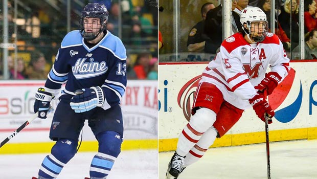
This is one of my favorite showdowns of the region. The colors used by both teams mix really well when placed next to each other. With Maine, we have a rare color combo for college sports. The powder blue and navy blue paired together creates a fantastic appearance. The Columbus Blue Jackets have tried this color combo with their alternate jersey, and it also worked for them. Aside from the colors, I’m liking the script font across the chest.
Miami played it simple: red and white. And although these words will not be represented by the voting results, Miami truly has a nice looking uniform. I have not complaints.
Voting Results: Maine wins, 5-0
No. 7 Denver vs. No. 10 North Dakota
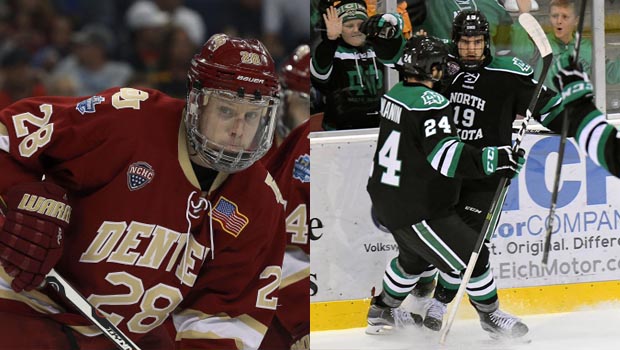
If this were and actual hockey matchup, we’d be in for a treat as these are two of the strongest programs in North America. Denver comes in with their red, gold, and white trio with Denver spelled out on the front and the player number right below it. I like that they have the shoulder “DU” patch on both sides, as well as the American flag on the left upper chest.
North Dakota has a big advantage here, even as a No. 10 seed, thanks to their colors. There’s something about the shade of green that they use that when paired with black and white looks awesome. I like that “North Dakota” wraps around the player’s number on the front of the sweater, and I like that they use the “shoe string” lacing at the front of their collar (as does Denver). In the end, I think the colors used by North Dakota may have had something to do with the voting.
Voting Results: North Dakota wins, 3-2
No. 2 Minnesota vs. No. 15 Harvard
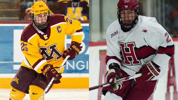
I think Minnesota has one of the best uniforms in the nation obviously, as they are our No. 2 seed in the region. The yellow, maroon, and white color scheme is almost perfect. The big “M” on the chest, while quite large, doesn’t look out of place or even too big. It just works. Then they’ve got the silhouette of the state of Minnesota at the base of their neck, which is an awesome touch to an already incredible hockey sweater.
Harvard went the route of the aforementioned Montreal Canadiens, with that bold black and red stripe circling their sweater and their logo place over top of it. It’s a nice, classic look for a team that is just that.
I’d be remiss if I did not call out my co-workers on this one, however. How you guys came to the conclusion that you did between these two uniforms, I will never know. Here we have our biggest upset in the region.
Voting Results: Harvard wins, 3-2
Updated Uniform Tournament Bracket
MORE UNIFORM MADNESS: Basketball Bracket, Baseball Bracket, Football Bracket